World Population Statistics

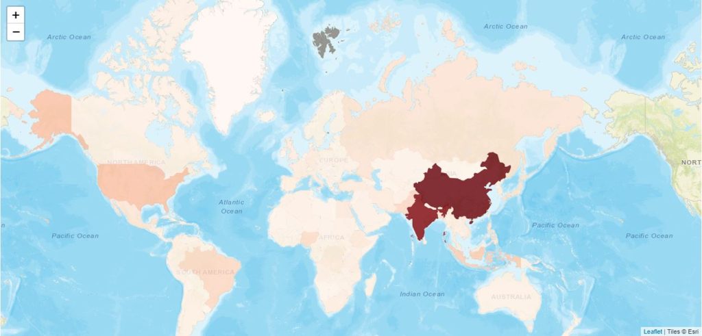
World Population 2019 (Click the picture for further exploration)

There is much debate around world population, fertility and wealth distribution. People often see what they want to see and choose to ignore what they don’t like. People are selective and don’t always look at the full data available.

I thought it would be a nice idea to graphically look at various measures for population and wealth across the world. Later I will also look at consumption and pollution or greenhouse emissions.

The first chart is probably the most obvious. Most of us know that China and India have the largest populations in the world. But sometimes we forget that these are two of the largest countries in the world. They have a huge amount of land.

Perhaps population density is a more suitable metric.
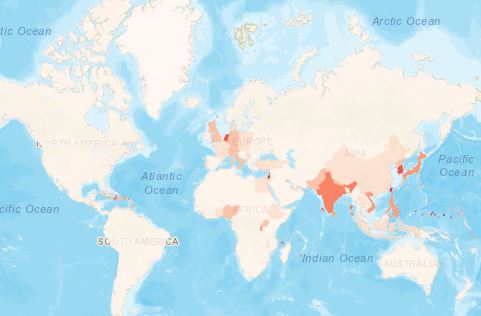
Population Density 2019 (Click the picture for further exploration)

China falls significantly but still is quite high. For the purposes of the chart above I have removed those countries with densities/km of over 1000. Why? Because city states like Monaco and Macao have very high densities, due to being small and highly populated but also due to large numbers of people who claim residence there for the tax breaks they can avail of.

Countries with greatest population density (Click the picture for further exploration)

Bangladesh is the first of the larger countries to make an appearance.

But looking above, we also see that as well as South-East Asia, most of Europe is also densely populated. Parts of Africa are densely populated but as a continent, vast parts of it are empty. There is a huge amount of land in Africa and not that many people to fill it.
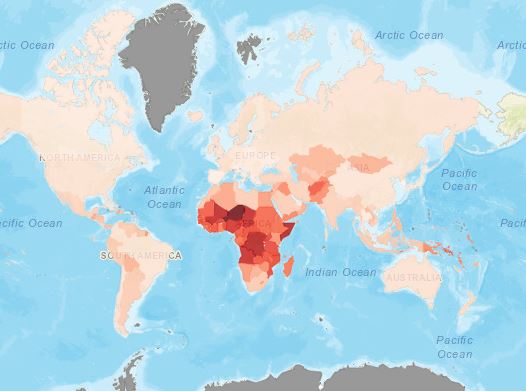
Fertility Rates 2019 (Click the picture for further exploration)

The map above shows something that worries a lot of people. In most of the world, fertility rates have dropped massively. Much of Western Europe sees fertility rates below 2.1 which is considered about replacement level. The implementation of the 1-child policy(now revised to 2) in China saw it’s fertility rate drop radically. To the extent that the Chinese government worries both about a dropping population(in future) and a predominance of men over women(due to gender-selective abortion). There are worries here for an aging population, unable to be supported by the younger section of the population, and social problems brought about so many men who cannot find women to marry. “In 2016 there were 33.59 million more men than women.

In Europe, states such as Italy are driven to pay people to move into areas with declining populations. In Japan older people are turning to robots for both care and company.

While governments are worried about the economic and social effects of declining populations and possible effects of migration, it must be strongly argued that a reduction in the human population is good for all other life on the planet. It is good for the continued existence of humanity on this planet and the planet itself as a living entity. While the shifting demographics give rise to certain challenges, these are as nothing compared to the challenges presented if we kill off most other species of life, plant and animal, and encourage an increasingly erratic and hostile climate.

World Population Statistics
United Nations Population Division estimates
https://www.worldometers.info/world-population/population-by-country/

Italian region will pay you to move in
Irish Times
http://www.irishtimes.com/life-and-style/homes-and-property/fancy-an-easyish-25-000-this-italian-region-will-pay-you-to-move-in-1.4016095

Robots as companions
Dateline
https://www.sbs.com.au/news/dateline/love-intimacy-and-companionship-a-tale-of-robots-in-japan

China’s One-Child Policy
Britannica
https://www.britannica.com/story/the-effects-of-chinas-one-child-policy

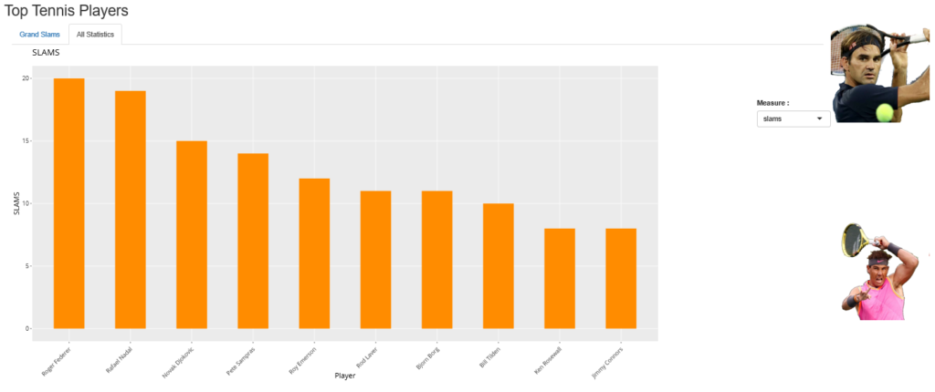
Greatest Tennis Players – Updated

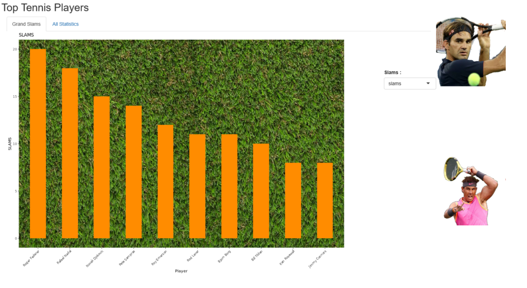
Tennis : Rafa Nadal wins his 19th slam and moves within 1 of the all-time record of 20 by Roger Federer.  If you believe that the all-time greatest mantle depends on the amount of slams won, does this mean that Rafa Nadal is in position to take the crown. You can look at these and other statistics about the greatest tennis players at my visualisation below.

Roger Federer won his 20th Grand Slam at the Australian Open in 2018. At that stage Rafael Nadal held 16 Grand Slams in total and it looked likely that Roger Federer would maintain the title of most amount of slams. Since then Nadal has won 3 slams and Federer has won none. Nadal still seems like a lock in to win the French Open each year, unless someone like Dominic Thiem can improve further and somehow become the only man to beat Nadal in a French Open final. Or will Nadal start to fade and not make it to the final?

Federer is 38 and cannot play forever. Nadal and Djokovic are at least 5 years younger and, if they emulate Federer, have many more years of playing and winning in front of them. And while they have stumbled in the past, 2019 has belonged to both Nadal and Djokovic.

But the young 23-year old Daniil Medvedev pushed Nadal hard at the 2019 US Open and perhaps next time can beat him(or anyone else) in a Slam Final. Thiem, Zverev, Tsipitas and others also show promise from the younger generation.

It should be a most interesting changing of the guard.

#tennis #record #rafanadal #rogerfederer #wins #slam

Updated Dublin Property Data 2010-2019

Property Price Register Dublin Ireland 2010 to 2019

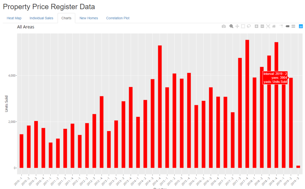
I have updated the property data section of my website.

It now has data up until the end of June and a few days of July. It shows the tail off in both property sales and prices for the Dublin region. Using the interactive charts you can explore the property sales by volume and price for the whole of Dublin or individual regions of Dublin. I have added pop-ups to the charts as well so that you can more easily see the actual values represented by each bar in the chart. You can also view the values by year, quarter or month.

The property selling market is seasonal. So sales normally happen in spring and autumn. Of course, calendar quarters overlap the seasons. So spring overlaps Q1 and Q2 while autumn overlaps Q3 and Q4, but form the charts you can see that Q4 is usually the biggest quarter and Q3 is usually the 2nd biggest. So for comparisons one should compare Q2, 2019 with Q2, 2018. You shoudl compare Q3, 2018 with Q3, 2017 etc.

As there is only a very small amount of data for July 2019, any readings for that month or for Q3,2019 are not reliable and should not form the basis of any analysis.

Greatest Tennis Players of All Time

As Wimbledon is upon us I wanted to create an application that allows us to easily compare the different statistics for the contenders to the GOAT, the Greatest Of All Time in the tennis world.

Incredibly we have 3 contenders to this claim playing.

Roger Federer
Rafael Nadal
Novak Djokovic

Others from the past include

Rod Laver
Ken Rosewall
Jimmy Connors
Pancho Gonzalez
Bjorn Borg

Who would your favourite be?

http://analytics.richardfitzsimons.ie/sample-apps/tennisstats/

Let me know if I have missed anyone. Competions change over time. The Open Era means now that anyone, amateur or professional, can contest all competitions whereas before if a player turned professional they could not play in the Grand Slam tournaments(Australian, French Open, Wimbledon, US Open). There were also different competitions, the Pro Series. Yet remarkably Rod Laver won the yearly Grand Slam twice, before and after turning professional.

In the past the Australian Open was not seen as important as the other slams and was skipped by a lot of players. Now it is definitely considered one of the 4 most important destinations on tour.

Surfaces also change. At one point your surfaces were really clay and grass. Now there also different types of hard courts, as well as variations in clay and grass.

It still seems too early to see who will be the next contender after the current 3 mentioned above. Will Dominic Thiem, Alexander Zverev, Stefanos Tsitsipas and the other young contenders step up to the plate or will we have to wait longer for the next great contender?

Random Password Generator

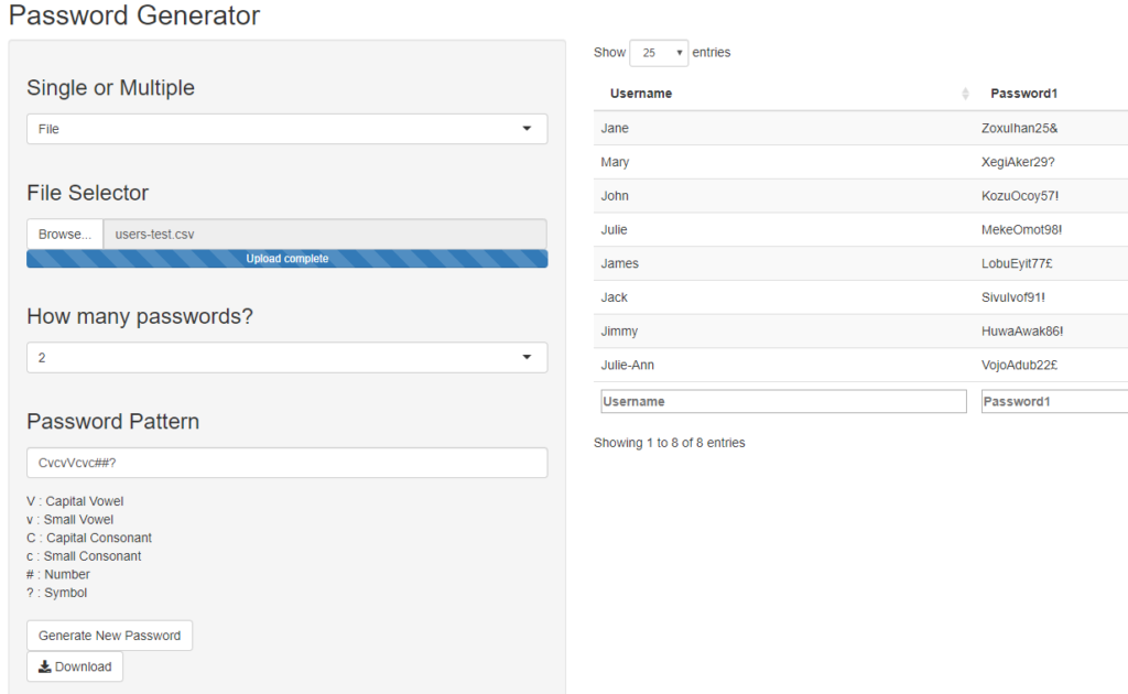
Here you will find an application that generates random passwords according to the pattern you decide or want.

You can generate between 1 and 4 passwords on an ad hoc basis or you can import a CSV file and generate passwords for every line of that CSV file. So you can upload a list of users, say, and then download a CSV file of the users with their newly generated passwords.

As I thought it might be useful, below there is a PowerShell script to change passwords on an Active Directory server using the supplied CSV file. Be careful as the file below also prevents the user changing passwords in future. You can of course delete or comment out this line.

Import-Module ActiveDirectory
#Import users from csv file
Import-Csv C:\New-Passwords.csv |
ForEach-Object {
$samAccountName = $_.”samAccountName”
$newPassword = $_.”Password”
Write-Host $samAccountName ” : ” $newPassword
# Reset user Password.
Set-ADAccountPassword -Identity $samAccountName -Reset -NewPassword (ConvertTo-SecureString -AsPlainText “$newPassword” -Force)
# Prevent User changing password
Set-ADUser -Identity $samAccountName -CannotChangePassword $True -PasswordNeverExpires $True
# force user to reset passwod at next logon
# Set-ADUser -Identity $samAccountName -ChangePasswordAtLogon $true
Write-Host ” Active Directory account Password has been reset for: ” $samAccountName
}

West Wood Gyms Class TimeTable

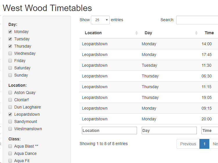
West Wood now have 6 gyms located around Dublin and many classes in each gym. I find it difficult to find the classes I want at the times I want as there are so many classes.

I created a small timetable application to help me and am sharing it here. Click on the image above to open the timetable.

Thanks for looking

Property Price Register (Ireland)

Main Image : Heat Map of Dublin
Shows price and house sales.

I am Irish and I live in Ireland. I am surrounded by other Irish people.

Being Irish, we love property;

  • We love to buy property,
  • We love to live in our own property
  • We love to invest in property

We talk about property all the time. We’ve had property busts and booms, and a boom again.

So I wanted to look at publicly available property data.

In 2012 the Irish Government set up the PRSA and instituted the Property price Register. It was after the property bust of 2008 and it was thought a good idea to have a public record of what was happening in the property market.

To quote TheJournal.ie,

“The register provides the price, address and date of sale on all residential properties which have been purchased in Ireland since 1 January 2010 and allows people to view the prices of houses which have been sold around the country.

There had been calls for such a register to be set up for several years in order to provide open information on a notoriously secretive area.”

Furthermore to quote the Independent, quoting the PRSA,

The PSRA has said that the register is not intended to be a property price index but instead is designed to “provide, on an ongoing basis, accurate prices of residential properties purchased at a particular date”.

In response to queries about the accuracy of the figures provided on the site the PSRA has put up a note saying that it does not edit the data but simply publishes the figures which are filed by the purchaser’s solicitor.

“The Authority acknowledges that there are errors in the data,” the note reads. “Where errors are discovered or reported to the Authority they will be taken up with the Revenue Commissioners”.

As it turns out this is correct. The register is a disgrace. There are many deficiencies as follows

  • Very little information(few fields. No geographic information other than address)
  • Vague brackets of measurement (size)
  • Many empty records(ie certain fields not filled out. Eg. Description and size)
  • Incorrect prices filed
  • Spelling mistakes in the data, making a nonsense of the information
  • Also a sale may represent a single house or apartment, or a complete block of apartments or batch of houses. So the median is a more representative measure of house value than the mean.

It makes one wonder what the point of the database was in the first place.

On the plus side

  • It exists!
  • It is publicly available.
  • Using certain tools, you can augment the given information.

Shane Lynn has a website where he makes available a python script(also R) that utilises Google Maps’ geocoding tool to add geographical information to the property price register. It is a little complex to setup but is a great resource. You can access his website here.

So, now that we have data available, I have created some maps.

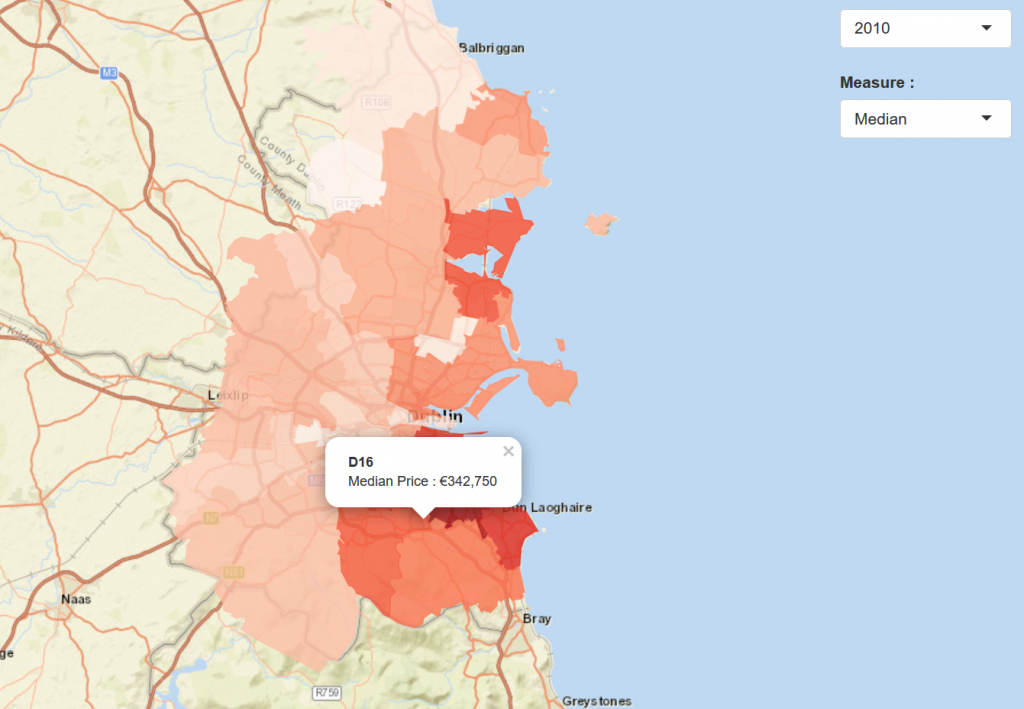
Dublin Heat Map

The first is a heat map showing the different statistics for each Postal Area of Dublin in the years 2010 to 2019(Currently January).

Using the measures option on the right you can choose to show various statistics on the prices for that area:

  • max
  • min
  • median
  • mean

And then

  • sum

is just to tally up the total amount of house sales in that region per year.

Individual Properties

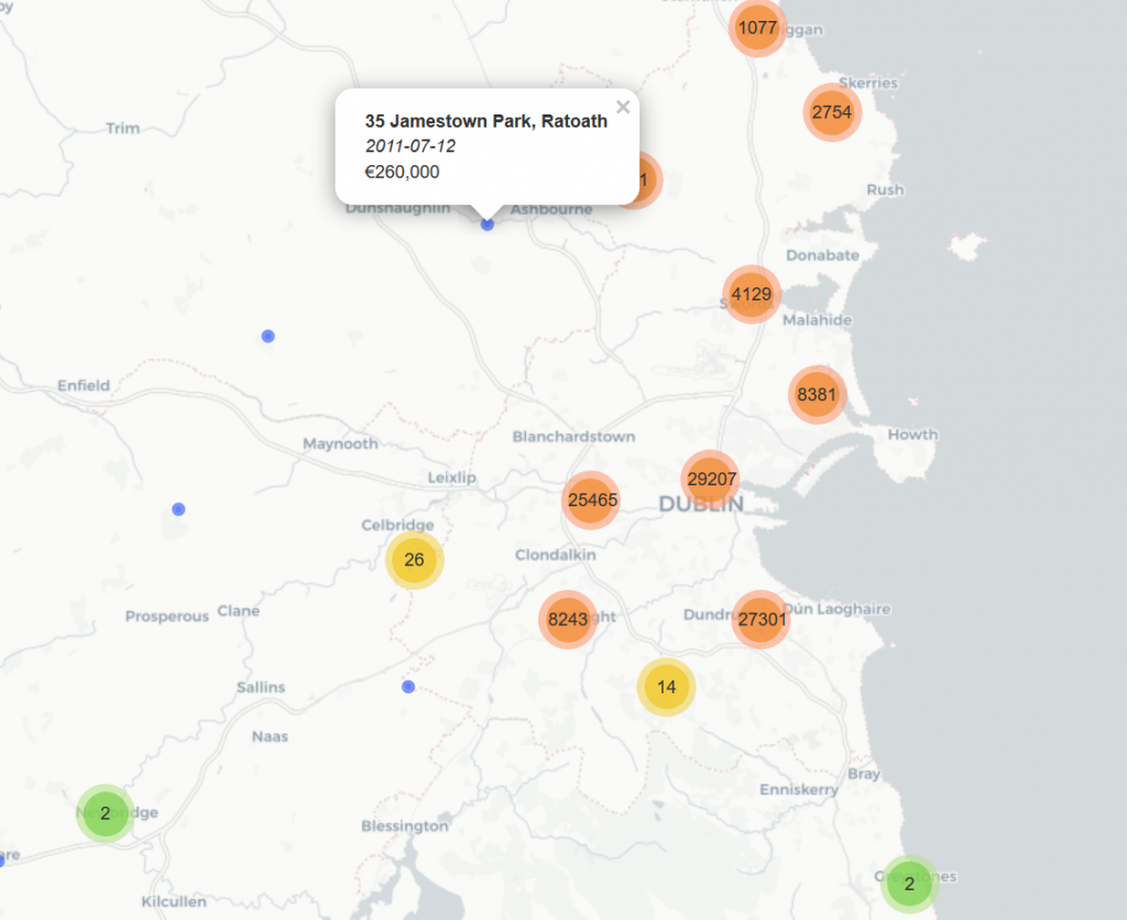
The second is a map of every property(that could be geocoded) in the Dublin area, its address, its sale date and its price(as well as, of course, its location).

I do want to present some further information in this area and will do so at a later date.

Thanks for reading and looking. Please let me know what you think.

Resources

https://www.propertypriceregister.ie/website/npsra/pprweb.nsf/page/ppr-home-en

https://www.thejournal.ie/property-price-register-ireland-633239-Oct2012/

https://www.shanelynn.ie/tag/property-price-register/

Carbon Footprint Calculator

Carbon Footprint Calculator Image

(You can click on the image above to access the calculator)

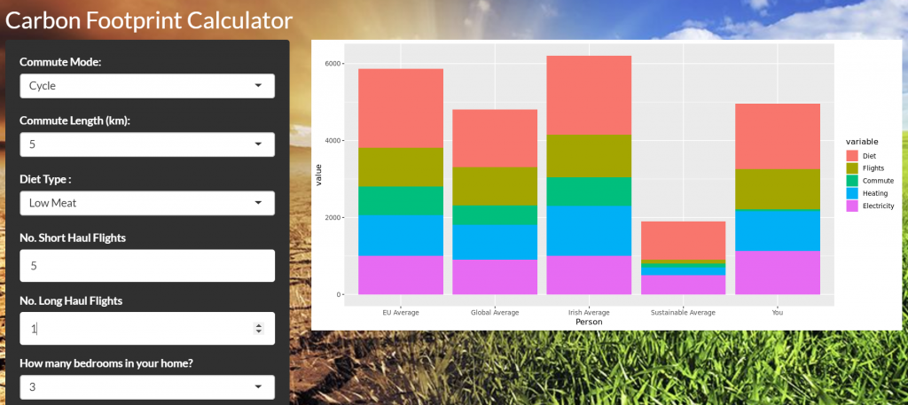
This is a simple Carbon Footprint Calculator. Rather than being difficult to use and comprehensive I have tried to make it easy to use and more a tool to see the difference that lifestyle choices can have on your carbon footprint.To this end I have focused on the biggest impacts different aspects of our lives have on our personal carbon footprint. Ideally we should perhaps add a measure for both other personal activities, and for the general industrial and commercial carbon emissions of a country, assigning a proportion to each resident of that country.

The calculator focuses on 5 main areas

  • Diet
  • Commute
  • Flights Taken
  • Home Heating
  • Electricity

SSE Airtricity claim that 100% of the electricity they generate is from renewable sources. I have taken this claim at face value. It’s impressive if true. Electric Ireland would claim(probably correctly) that they still need to use Fossil Fuels to ensure enough electricity is available at all times. However in the long run we can hope that most electricity is generated from rewnewables and store in different ways(batteries / hydro etc.)

I have not yet allocated an option for Electric cars. They still need a lot of power to operate but the hope is that if this is from electricity it could be from renewable sources. Also sometimes it will be part of your electricity bill, or at the moment, you might be able to use the free on-street chargers provided by Electric Ireland.

There is a lot of debate at the moment about diet. The Lancet medical journal published research suggesting that the world’s entire population would have to shift to a nearly Zero-Meat diet to ensure sustainability. This caused a lot of consternation amongst meat eaters. But just because they don’t like it doesn’t mean it isn’t true.

Long-term sustainable CO2 emissions per person are really low. At the moment there is a huge disparity between the extremely high emissions by industrialised nations(USA & Europe particularly) and the rest of the world(particularly Africa). This will have to change. Estimated population growth is still high but is reducing. It’s going to be a really tough challenge but with the right mindsets, political will and the right modern technologies it will be possible. But people, industry and politicians need to stop shirking responsibility and take action now.

http://www.co2list.info/topics/goals

Thanks for visiting and reading. If you click on the title of the post, you can go to a page where you can comment. Any suggestions on how to improve the calculator or just opinions/discussions in general are welcome. Abuse is not.

You can find the calculator at

http://analytics.richardfitzsimons.ie/sample-apps/cfc/

I needed to get data for all the various factors that are used in the calculator. Some of these sources are listed below.

Sources on diets came from

Source : http://shrinkthatfootprint.com/food-carbon-footprint-diet

Sources on commuting options came from

Source : https://www.sightline.org/2008/02/08/planes-trains-and-automobiles/

Sources on Aviation Emissions came from

Source : https://www.carbonindependent.org/sources_aviation.html

While sources on Electricity generation came from

Sources :
https://www.electricireland.ie/residential/help/billing/fuel-mix-disclosure
https://www.bordgaisenergy.ie/docs/publications/GreenSourceProducts1.pdf
https://www.sseairtricity.com/ie/home/about-us/fuel-sources/
https://www.sseairtricity.com/uk/home/about-us/fuel-sources/