UN Data – Visualised

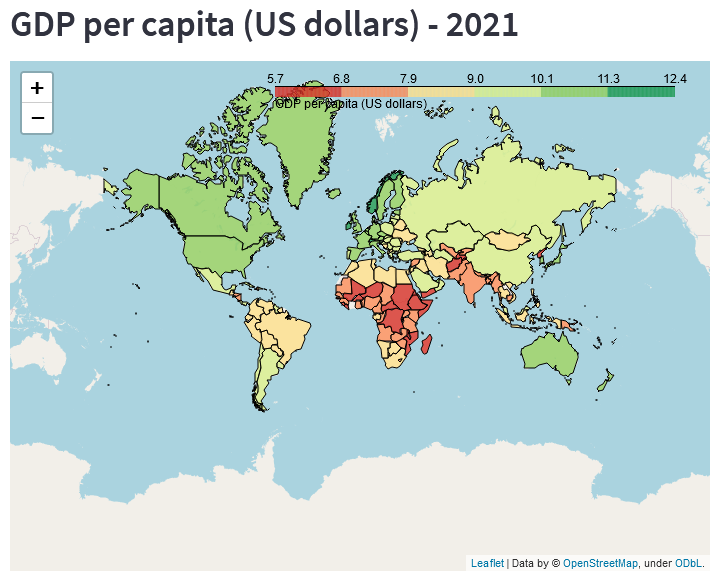
The United Nations (UN) provide a lot of data for download and use.

The data is available here https://data.un.org/

These datasets cover a wide range of socio-economic and environmental topics.

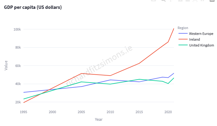
I have created a dashboard to explore some of these, as listed below.

The dashboard is available at https://analytics.richardfitzsimons.ie/undata/

0GDP in current prices (millions of US dollars)
1GDP per capita (US dollars)
2GDP in constant 2015 prices (millions of US dollars)
3GDP real rates of growth (percent)
4Population annual rate of increase (percent)
5Total fertility rate (children per women)
6Infant mortality for both sexes (per 1,000 live births)
7Maternal mortality ratio (deaths per 100,000 population)
8Life expectancy at birth for both sexes (years)
9Life expectancy at birth for males (years)
10Life expectancy at birth for females (years)
11Population mid-year estimates (millions)
12Population mid-year estimates for males (millions)
13Population mid-year estimates for females (millions)
14Sex ratio (males per 100 females)
15Population aged 0 to 14 years old (percentage)
16Population aged 60+ years old (percentage)
17Population density
18Surface area (thousand km2)
19Emissions (thousand metric tons of carbon dioxide)
20Emissions per capita (metric tons of carbon dioxide)

Please feel free to explore and ask any questions or make comments below.

Thanks

Richard

Property Price Register – Mapped 4

I have updated the Property Price Register application.

Property Price Register – Mapped

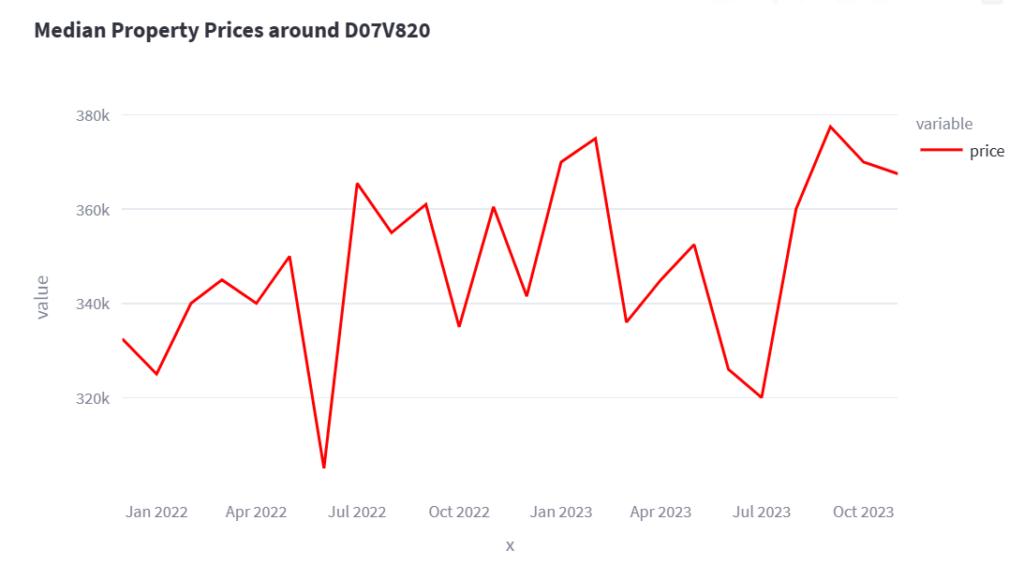
As well as being able to enter an eircode or area code, and seeing all the properties that sold in this area in the last 2 years, the application now generates a description about the area. This feature uses OpenAI to generate the description, and the results so far look promising.

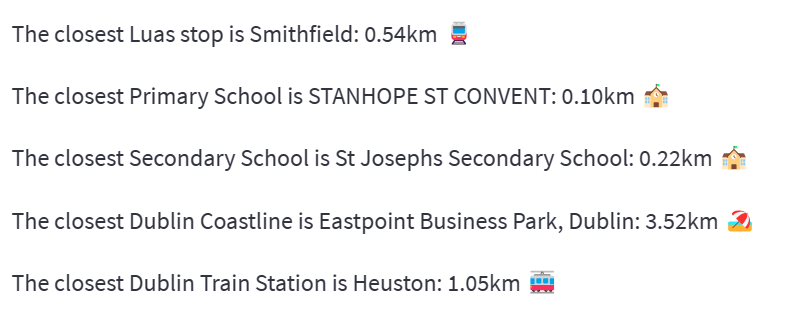
Separately, the application also works out the closest distance to luas stops, train stations, schools and coastline. Some of these are Dublin specific but will be expanded when I get the time and data to implement.

Please let me know any comments or suggestions below.

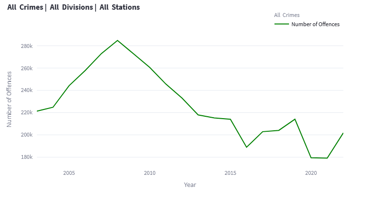
Irish Crime Statistics: 2003 – 2022

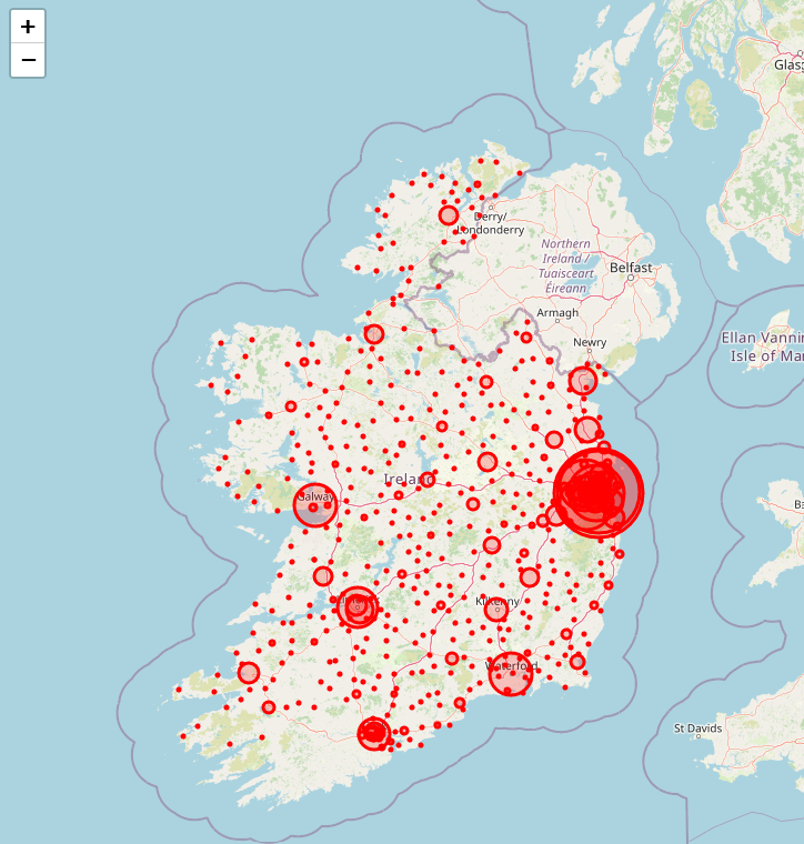
Crime statistics are recorded by the Gardai and are reported to one of the 566 Gardai stations country-wide.

The categories of crimes are

  • Theft and related offences
  • Burglary and related offences
  • Public order and other social code offences
  • Damage to property and to the environment
  • Fraud, deception and related offences
  • Controlled drug offences
  • Attempts/threats to murder, assaults, harassments and related offences
  • Dangerous or negligent acts
  • Robbery, extortion and hijacking offences
  • Offences against government, justice procedures and organisation of crime
  • Weapons and Explosives Offences
  • Kidnapping and related offences

Using the interactive dashboard, you can filter by Type of Offence, Year, Division and Station. Getting the data for the stations was difficult as there were many different spellings of station names. If you notice any issues, please let me know in the comments.

All statistics are Under Reservation and can be found at https://www.cso.ie/en/statistics/crimeandjustice/recordedcrime-statisticsunderreservation/

Property Price Register – Mapped 3

Hello all. I have updated the PPR data maps to the latest data.

I have also modified the code that now you can search for an Eircode routing key as well as a full Eircode.

In other words, you can type in D01 and search as well as D01A1B3.

I could see that many people were interested in searching for a general area rather than a specific Eircode.

Property Price Register – Mapped 2

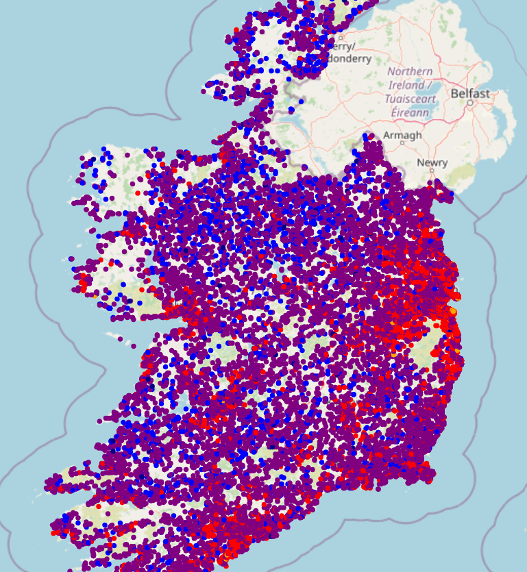
Below you can find the Residential Property Price Register displayed in 2 different ways.

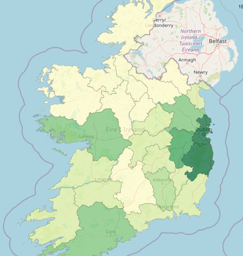
  • Each individual sale for 2 years mapped across the country, coloured by price
  • Mapped using the median price for each county

Clicking on each of the images below will load the actual interactive map for each.

Because the data is quite large the maps take a while to load.

Be patient!

Property Price Register – Mapped

Irish people love property.

And we love to browse property and see what properties sold for in different areas. Call us nosy or just interest in our fellow citizens.

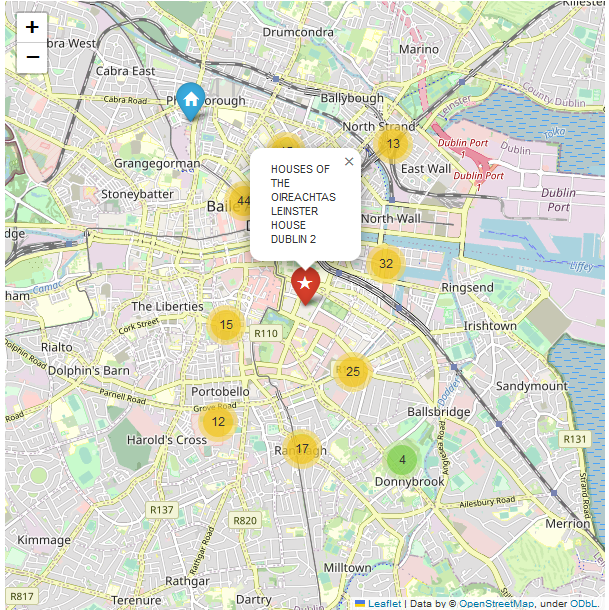
You can click on the following link and using an eircode browse sold properties in the area of that eircode. For instance, below you can see images of properties around the Dail (D02 XR20).

https://analytics.richardfitzsimons.ie/ppr/

You need an eircode. I have created the following website to take an input of a postcode (all postcodes in Ireland older than a few years should work). You can also look up eircodes at the following link.

https://finder.eircode.ie/#/

The website works on normal laptops and computers and also has a mobile interface. It does work better on a bigger screen like a laptop though.

The map will centre on the eircode you entered and will search the register for properties in that area. You will also see the lowest, median and highest prices for that area.

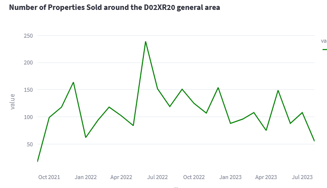
There will be charts showing the history of the median and mean prices for the period and the number of properties sold for that window.

Updated Corona Statistics for Ireland

http://analytics.richardfitzsimons.ie/sample-apps/corona/

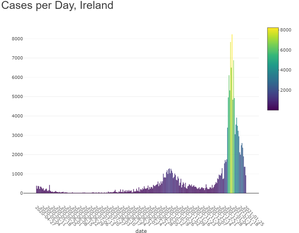
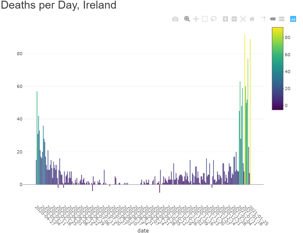
So this is the kind of chart that we have all become familiar with over the past few weeks. The relaxation of lock-down rules over December and Christmas led to a huge spike in cases. The ‘3rd wave’ far surpassed the ‘1st’ and ‘2nd’ waves. Sadly, the massive spike in cases led to a massive spike in deaths too, about 10 to 14 days later as we can see below.

Commiserations to all those who have lost loved ones. It has been a very difficult period, both losing loved ones and being unable to meet or hug your loved ones, families, parents.

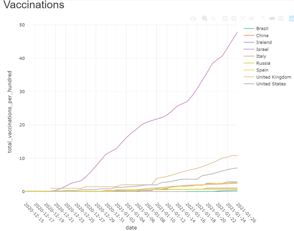
However, 2021 has also seen the introduction of vaccines. Some countries like Israel have been flying along and have nearly half their population vaccinated. They may even have achieved that milestone by the time you read this.

The numbers on the y-axis (on the left hand side) represent percentage of the population that have been vaccinated.

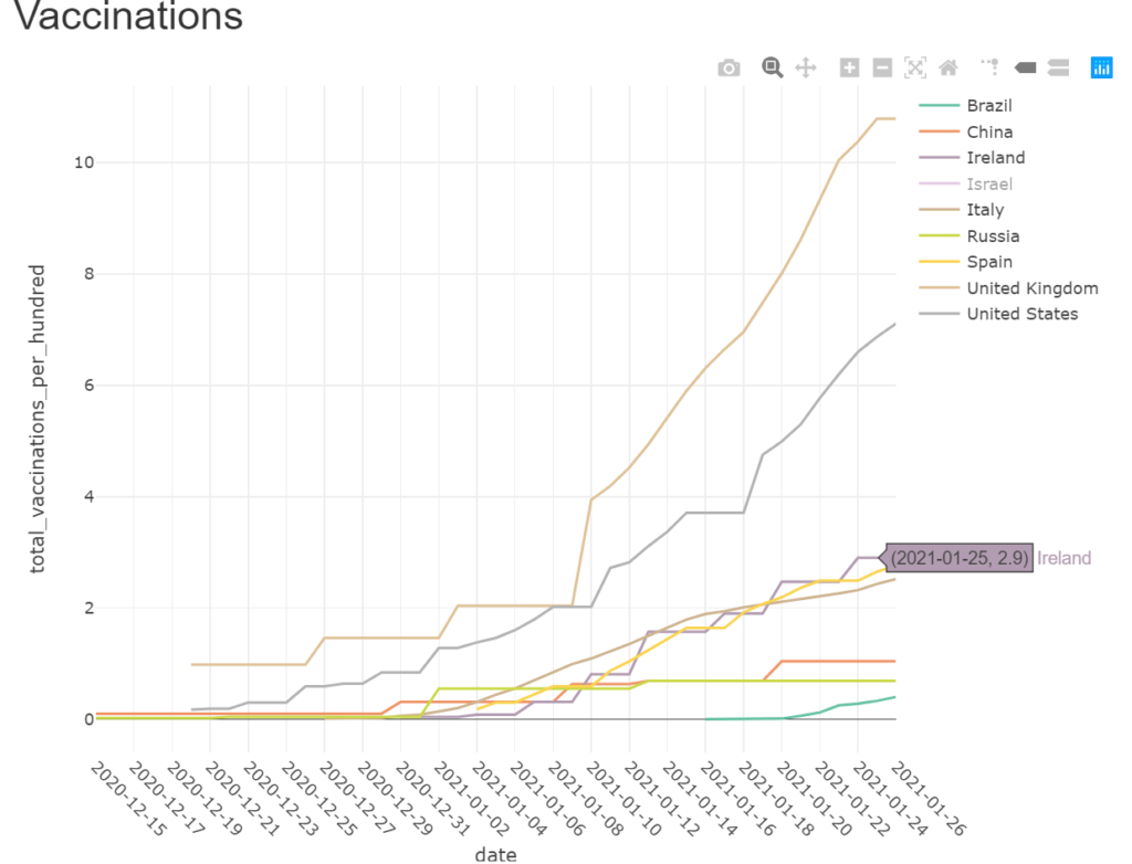
If we remove Israel, we can see how other countries including ourselves have been doing.

The United Kingdom and the United States have been doing pretty well. C. 10% and 6% of their populations have been vaccinated. Ireland, after a slow start is getting there, at about 2.5% of its population. But daily vaccination numbers will have to be massively ramped up, even to get our population vaccinated this year.

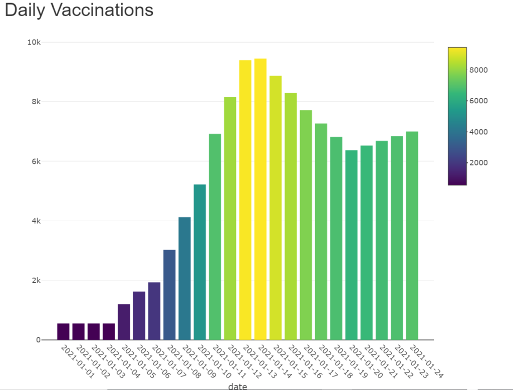
Below, you can see what the daily numbers for Ireland are like.

As always, if you click on the pictures they will bring you to a dashboard which is updated at least daily.

Or you can click below

http://analytics.richardfitzsimons.ie/sample-apps/corona/

Corona Virus – Top 15 Countries

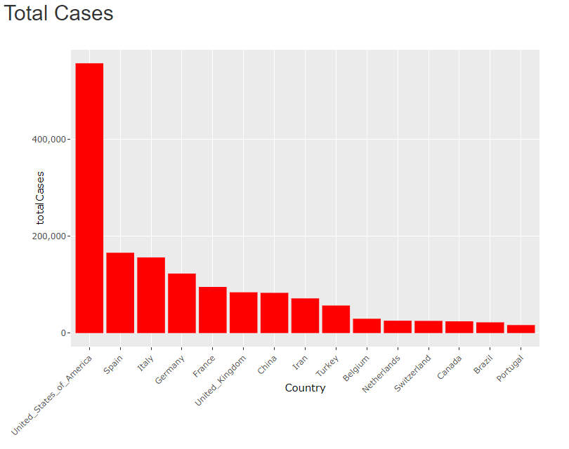
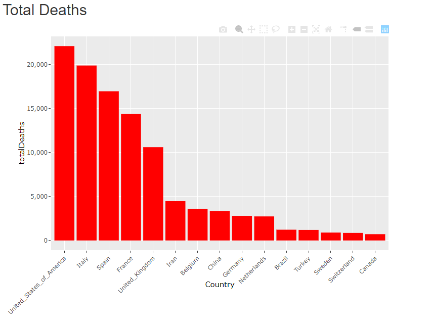
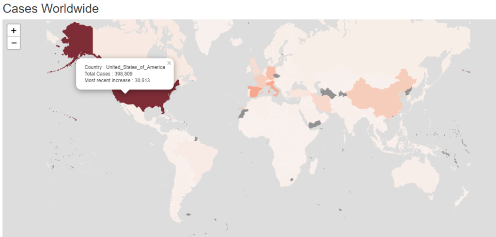
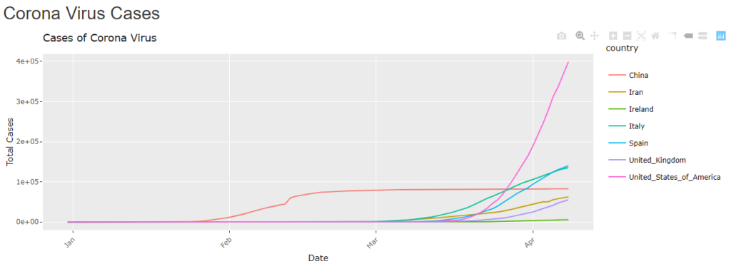
As might be expected, due to it’s population size, slow reaction and good reporting, the USA has sadly climbed to the top of two of our tables. They now report the most cases in the world and the most deaths in the world due to Covid19. At the moment, there is no sign of a slowdown so these figure are likely to continue to rise quickly. To date most of the cases have been in and around New York. If and when the virus spreads to the rest of the USA these figures will really escalate.

Italy and Spain are of course 2nd and 3rd in these tables. Interestingly though, Spain is deteriorating at a faster pace than Italy. Finally the situation in Italy may be becoming under control. Spain may be behind Italy in control and impact reduction. Both countries are already talking about loosening up the restrictions on trade and movement. Hopefully this is not too soon.

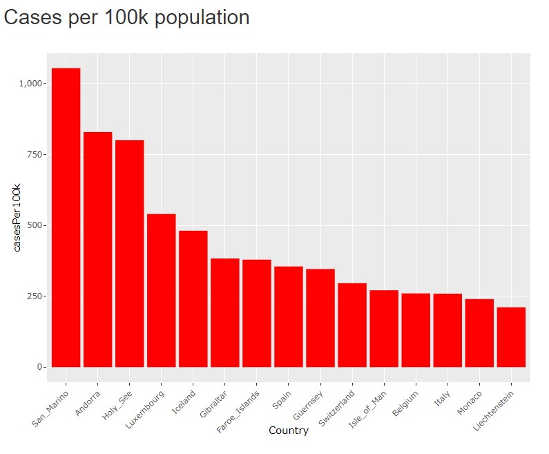
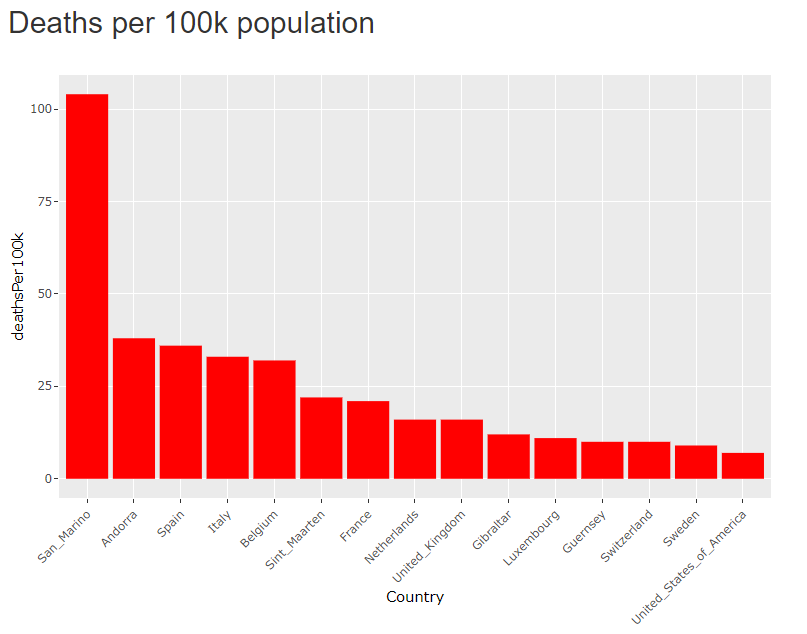
When You adjust the figures for population, things look decidedly different. The smallest nations with the highest population densities start to fare badly. San Marino looks particularly badly hit. If the figures are accurate, San Marino is showing a 0.1% fatality rate across it’s entire population. 1 in every 1000 people resident in San Marino has died of Corona Virus. Not for a particular demographic but for the entire population.

Of the larger nations, Spain, Italy and Belgium have a poor showing. The USA starts to show at No. 15 on the Deaths per 100k population” list. The likelihood is they will climb this table. The hope is that they will take control of the situation and keep their numbers low.

Data supplied from
https://data.europa.eu/euodp/en/data/dataset/covid-19-coronavirus-data/resource/55e8f966-d5c8-438e-85bc-c7a5a26f4863
https://data.gov.ie/dataset

Corona Virus in Ireland

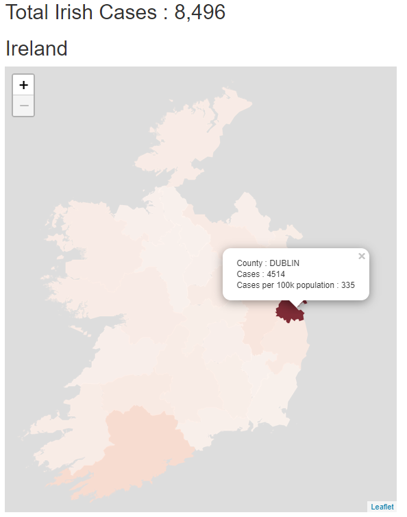
So as cases continue to rise around the world, most rapidly in the USA, how are Ireland doing? Cases and deaths continue to rise here although at a lower rate. The country is in near complete lock-down so a slowdown is inevitable and unsurprising.

The largest number of cases by far occur in Dublin and its neighbouring counties, followed by Cork. It is no wonder that communities in the fest of Ireland do not want to see holiday makers visit their rural and seaside communities bringing the virus with them, to towns and villages that do not have easy access to health services.

How are we doing in comparison to other countries?

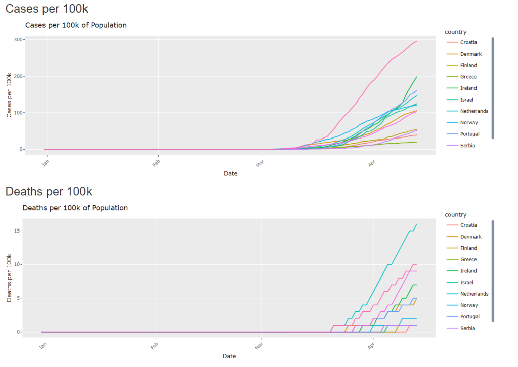
Comparing the Irish statistics to other countries of similar sizes and population and then adjusting for population, we see that we are average for the amount of deaths. We are doing quite badly when it comes to cases. In this group, we are second only to Switzerland(who neighbour one of the worst affected countries, Italy). But if you see that our ranking for deaths is much lower than for cases we can assume that our health service is doing a great job at keeping people alive and helping them recover.

The Netherlands seems to be faring very badly, with a large loss of life. Perhaps this is related to a high population density, maybe with an under reporting of cases until those cases die.

A reminder that you can create your own charts and comparisons at the link below.

http://analytics.richardfitzsimons.ie/sample-apps/corona/

Data supplied from
https://data.europa.eu/euodp/en/data/dataset/covid-19-coronavirus-data/resource/55e8f966-d5c8-438e-85bc-c7a5a26f4863
https://data.gov.ie/dataset

Corona Virus Maps & Charts

At the time of writing there is only one item on the news. There is only one subject on everyone’s lips; the Corona Virus or COVID19 to use it’s more terrifying moniker. We know that the virus started in a ‘wet market’ in China and has spread rapidly throughout the whole world, helped by a large world population and the prevalence and ease of travel, particularly by air.

The data is changing rapidly day by day and it’s hard to keep up. The initial figure from China looked terrifying, but these figures have been surpassed by other countries in different ways such as Italy, Spain and the United States. Even Iceland has a bad record for one particular metric.

So the virus started in China and the figures looked bad. But the Chinese authorities reacted quite quickly, if not straight away. The city of Wuhan and it’s province, Hubei, were put into complete lock-down. People had to stay in their homes and were not allowed to travel or socialise or move around. This seems to have the required effect. New COVID19 cases in China have slowed to a trickle and the virus looks like it has been beaten.

Or has it? Depending on who you believe there are still major problems in China. The figures are just not being reported. (Cite. Time Magazine : https://time.com/5813628/china-coronavirus-statistics-wuhan/)

Elsewhere, in non-Communist, multi-party states(many democracies) the policies, restrictions and sometimes lock-downs have been erratic and come in fits and starts. Phrases like ‘lock-downs’, ‘social distancing’ and ‘self-isolation’ have become part of common speech. If you have anyone to speak to that is. There has been much debate about how to react. Restrict all movement? Achieve something called ‘herd immunity’? Close down the economy or keep it running despite the cost in lives. There have been many U-turns and, no doubt, there will be many more.

The aviation and tourism industries have ground to a complete halt. Many shops, restaurants and cafes may not survive the shutdown. Some companies who provide or enable remote working and socialising may benefit.

But it looks like the world will continue to change and may remain irrevocably changed after this virus.

You can find the charts and maps, and interact with them at

http://analytics.richardfitzsimons.ie/sample-apps/corona/

They will be updated on a daily basis as more figures are released.

Data supplied from
https://data.europa.eu/euodp/en/data/dataset/covid-19-coronavirus-data/resource/55e8f966-d5c8-438e-85bc-c7a5a26f4863
https://data.gov.ie/dataset