At the time of writing there is only one item on the news. There is only one subject on everyone’s lips; the Corona Virus or COVID19 to use it’s more terrifying moniker. We know that the virus started in a ‘wet market’ in China and has spread rapidly throughout the whole world, helped by a large world population and the prevalence and ease of travel, particularly by air.
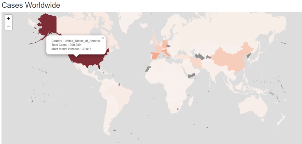
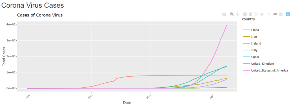
The data is changing rapidly day by day and it’s hard to keep up. The initial figure from China looked terrifying, but these figures have been surpassed by other countries in different ways such as Italy, Spain and the United States. Even Iceland has a bad record for one particular metric.
So the virus started in China and the figures looked bad. But the Chinese authorities reacted quite quickly, if not straight away. The city of Wuhan and it’s province, Hubei, were put into complete lock-down. People had to stay in their homes and were not allowed to travel or socialise or move around. This seems to have the required effect. New COVID19 cases in China have slowed to a trickle and the virus looks like it has been beaten.
Or has it? Depending on who you believe there are still major problems in China. The figures are just not being reported. (Cite. Time Magazine : https://time.com/5813628/china-coronavirus-statistics-wuhan/)
Elsewhere, in non-Communist, multi-party states(many democracies) the policies, restrictions and sometimes lock-downs have been erratic and come in fits and starts. Phrases like ‘lock-downs’, ‘social distancing’ and ‘self-isolation’ have become part of common speech. If you have anyone to speak to that is. There has been much debate about how to react. Restrict all movement? Achieve something called ‘herd immunity’? Close down the economy or keep it running despite the cost in lives. There have been many U-turns and, no doubt, there will be many more.
The aviation and tourism industries have ground to a complete halt. Many shops, restaurants and cafes may not survive the shutdown. Some companies who provide or enable remote working and socialising may benefit.
But it looks like the world will continue to change and may remain irrevocably changed after this virus.
You can find the charts and maps, and interact with them at
http://analytics.richardfitzsimons.ie/sample-apps/corona/
They will be updated on a daily basis as more figures are released.
Data supplied from
https://data.europa.eu/euodp/en/data/dataset/covid-19-coronavirus-data/resource/55e8f966-d5c8-438e-85bc-c7a5a26f4863
https://data.gov.ie/dataset


Nice item Richard. I’m interested in deaths per capita so thanks for providing that. However, I’d like to map Asia through January/February against MarchWestern world trend – is that data included?
Hi Lynn,
the data I am using is broken down by country. You could of course aggregate into continents in the same dataframe and then do your comparisons. The raw data I use is updated regularly and comes from the link below…
https://data.europa.eu/euodp/en/data/dataset/covid-19-coronavirus-data/resource/55e8f966-d5c8-438e-85bc-c7a5a26f4863
The Irish data comes from
https://data.gov.ie/dataset
Thanks
Richard